Case study
Voyager
A 30-year-old fleet-management product, modernized in 3 years instead of 10
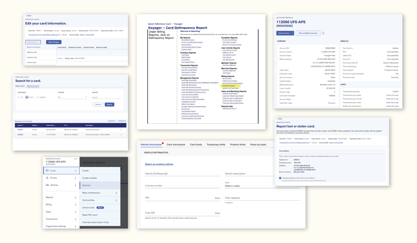
A grid of shipped Voyager screens — the 30-year-old product Fleet Managers use to manage fleet fuel cards, vehicle records, transactions, and reporting. Source: University of Kentucky's public training site for Voyager.
From 2023–2024 I led the design team on the overhaul of U.S. Bank's Voyager suite, including Fleet Commander Online — the 30-year-old product Fleet Managers use to handle fuel purchases and inform operations across commercial fleets. When I arrived, the UI/UX modernization roadmap was scheduled to take ten years. Over the next two years, my team and I changed that to three, while keeping a live, regulated product running for expert users.
I held the work as a Design Manager (formal title: VP, Development Group Manager, Transportation Services) embedded inside U.S. Bank's Product organization rather than the central Design org. Of roughly 360 designers in the broader design org at the time, about 12 of us sat structurally inside Product groups; that position gave me — and by extension the user — direct access to strategy, planning, and user research that most peers couldn't get.
Five years of modernization had already happened when I arrived. At the rate the work was moving — roughly 60% complete after five years, or about 12% a year — completion was tracking to early 2027. The institutional framing was "a ten-year roadmap." My team's job was to compress that runway in real terms, not just on the slide.
Problem
Voyager's users are expert Fleet Managers working with high-stakes data: regulated financial transactions across thousands of vehicles, tied to compliance and audit obligations the bank cannot afford to disrupt. The product was about 30 years old, and its UI/UX was already on a 10+-year modernization plan when I joined.
A ten-year roadmap for legacy modernization is a polite way of saying the work is genuinely hard and effectively infinite. Expert users have ingrained workflows they don't have time to relearn; decades of legacy code constrain what can be changed and how fast; compliance, risk, and business continuity put hard floors under every change. In practice, we saw that Fleet Managers were routinely exporting data out of Fleet Commander into spreadsheets or other tools because it was easier than working with the data in situ, and they were asking for better fraud-prevention tools and faster, shorter sessions in the product given chronic overwork.
Constraints
- Heavily regulated financial industry; every change cleared legal, compliance, and risk.
- Expert users with ingrained workflows; learnability constraints almost the inverse of a consumer product.
- A 30-year-old codebase with significant legacy weight and poor early separation between content, function, and presentation, which made structural changes expensive.
- Fleet operations could not pause; we were continuously delivering into a live environment.
- I sat in Product, not Design — different reporting line, incentives, and rituals than the Design org proper.
What I owned
I led a cross-disciplinary design team: 4 product designers, 2 accessibility consultants, 2 UX researchers, and 2 content developers. As one of the relatively small group of designers embedded in Product, I had direct access to roadmap planning, funding discussions, and user research in a way that most of the bank's 350+ central-Design-org designers did not, and my job was to use that access on behalf of the user.
The work threaded through Risk, Compliance, Fraud and Disputes, Servicing, Sales, Training, and Customer Service — designing in a regulated industry means being legible to a much wider set of internal partners than consumer product work. Embedded in Product gave the design team standing in those rooms; in the Design org I would have been downstream of every one of those conversations.
Key decisions and tradeoffs
1. Standardize reporting to unlock 80 templates
Early on, my team analyzed roughly 80 existing report templates and discovered that they were built from about a dozen repeating patterns: data filtering and sorting patterns used to surface fraud, understand spend, and guide vehicle maintenance and replacement strategies. We turned those patterns into shared reporting components and flows, so we could design and implement new reports by assembling proven pieces rather than reinventing from scratch each time.
Tradeoff: We accepted less bespoke variation in reporting UI in exchange for speed, consistency, and easier development and deployment across the Voyager products.
2. Use the design system to cut one-off work
Across Voyager, we aggressively increased use of the bank's design system to reduce one-of-a-kind components and patterns, and we coordinated design decisions with other departments to minimize duplicated effort. This was as much organizational design as visual design: getting multiple product teams to agree to shared patterns was a precondition for delivering modernization faster.
Tradeoff: Some teams gave up "pet" patterns and local variations, which cost negotiation time but repaid itself in long-term delivery speed and maintainability.
3. Modernize "create card + vehicle" without breaking expert workflows
The "create card + vehicle" flow is a core workflow for Fleet Managers, and in the legacy product it was a time-consuming, multi-step process with a lot of friction and opportunities for error. We redesigned it into a faster, partially automated flow with smoother, more intuitive batch processes, so a Fleet Manager could handle multiple cards and vehicles in a guided sequence instead of jumping between scattered screens.
Tradeoff: We deliberately preserved the basic conceptual sequence expert users were used to, even when a more radical re-imagining might have been "cleaner" on paper, in order to minimize retraining cost and disruption.
4. Progressive rollout with dual paths for experts
We did not flip the system wholesale. Instead, we used progressive rollout by customer segments, temporarily keeping old paths available while new flows came online for critical tasks like card and vehicle management. In parallel, Design took on work that hadn't historically been ours — rewriting training guides and including trainers and support staff as early stakeholders in the design process.
Tradeoff: Carrying some legacy UX longer complicated the codebase and design governance, but it dramatically reduced the risk of breaking expert workflows and contributed to fewer support calls and smoother adoption.
5. Put security, accessibility, and consistency ahead of "shiny"
In 2024 planning, I framed design priorities bluntly for Product and Engineering: "In order of importance: let's not get hacked, not get sued, and take the first steps to better usability." That captured a shared understanding that security, accessibility, and consistency were first-order design and development concerns in this domain, not afterthoughts.
Tradeoff: Some visually ambitious ideas and non-critical features waited; in return, we shipped improvements that made the product safer, more accessible, and more coherent for overworked expert users.
How we got from 10 years to 3
The compression from a 10-year UI/UX roadmap to roughly 3 was not a single heroic decision; it was a gradual realization over about 18 months as new standards and processes took hold. We combined several moves:
- Discovering repeating patterns in reporting and turning them into reusable components so we could move through 80 templates with far less bespoke work.
- Increasing adoption of the organization's design system to cut down on one-off components and patterns across Voyager.
- Coordinating design with other departments to reduce duplicated effort and align on shared solutions.
- Using the product-model transition to put in place "faster and leaner" ways of working, with stronger connections to internal groups and better evidence-based design leading to more measurable outcomes.
If I had to explain it to a skeptical VP in one sentence: new standards and processes, tied to a different position in the org chart, let us deliver more, faster, with better connection to the rest of the organization and clearer evidence for our design decisions.
Accessibility as a speed and quality lever
U.S. Bank is deeply committed to accessibility and integrates it at every level of the design process, and our work on Voyager was no exception. The design system and pattern libraries relied heavily on repeatable accessibility patterns, and our two accessibility consultants were partners rather than auditors.
That work did more than help compliance: better overall readability, clearer hierarchy, and more predictable interaction patterns made complex tasks easier and faster for distracted or hurried users — a common condition for Fleet Managers juggling many responsibilities. In other words, designing for accessibility directly supported one of the primary user requests: faster interactions and shorter, more efficient sessions in the tool.
What we chose not to touch
With a 30-year-old product, "what to touch and what not to touch" was a constant conversation. One ongoing frustration was the original architecture's poor separation of content, function, and presentation; if those layers had been cleanly separated from the start, revisions and upgrades would have been dramatically easier.
We left some deeply coupled structural elements alone in this phase because changing them would have combined technical risk, user disruption, and institutional inertia in ways that didn't make sense against our three-year horizon. The more senior I became in the work, the more I understood that those "non-changes" were as much design decisions as the screens we did update.
Outcomes
- UI/UX roadmap compressed from 10 years to 3. This happened gradually as new standards, components, and processes landed, rather than via a single "big-bang" decision.
- Better user experience for expert Fleet Managers. The combination of standardized reporting, improved card + vehicle flows, and accessibility-driven clarity contributed to faster task completion, fewer support calls, and better feedback from both users and internal partners.
- A structurally advantaged design team. We operated with design × product × engineering access that most of the bank's design org did not have, and we used that access to align priorities around security, accessibility, and consistency.
Voyager / Fleet Commander Online in use, captured from a public CNRG online demo. Modernized reporting, card-and-vehicle workflows, and design-system patterns shipped during the 2023–2024 work.
Measurement was a deliberate part of the work. The team ran SUS-style quarterly surveys, used the HEART framework, and built Goals-Signals-Metrics into the design rituals — not as a reporting tax but as evidence the design changes were doing what we said they'd do.
Reflection
The deeper lesson of Voyager for me is structural: a designer's position in the org chart can matter as much as the design decisions they make. Embedded in Product, I was in the room where planning and prioritization happened, and could argue directly that security, accessibility, and consistency were top design and development priorities; had I sat in the central Design org, I would have been significantly downstream of those discussions.
Methodologically, the Voyager compression was a long test of first-principles reasoning. In 2022 I gave a talk to the design org distinguishing "designing from first principles" from "design by allegory" — the latter being competitive surveys and incremental variation, the former being asking what we were actually sure was true and reasoning up from there. When an institutional roadmap says ten years, the temptation is to ask "how do we go faster within the plan?" First-principles thinking asks "what are the eighty reports actually made of?" The answer turned out to be twelve patterns. The insight wasn't novel. The discipline was.
If I were starting again, I would invest even earlier in understanding the full system around Voyager — especially the financial drivers of the product ecosystem, from interchange rates to fuel-price dynamics — because in a context like this, those forces ultimately determine how UX work is valued at the corporate level. The next generation of senior design roles, including at a place like Thomson Reuters, will live at that seam: close enough to Product and Engineering to influence strategy, and close enough to users and evidence to keep the work grounded.
One thing I'd do differently methodologically: lean even less on design sprints. Sprints can build alignment but tend to reward storytelling over design logic, and the Voyager work — long-running, regulated, expert-user — needed deep design logic more than rapid divergent ideation. The compression came from sustained pattern recognition, not from sticker votes.